|
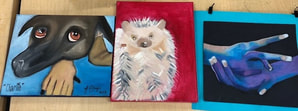
Thank you for an amazing Art III class Ms.Purtee, you're the best! Have a good break! 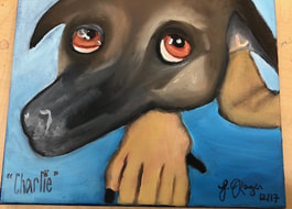 The piece shown on the left is my "new" piece.
0 Comments
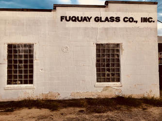 For the Scholastic project, the medium I chose was photography. I've always enjoyed photography and to be able to do it for this project was exciting. The location was in downtown Fuquay-Variena. I love that area and am always inspired when viewing the achietecture which is what inspired me to create this.
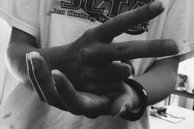
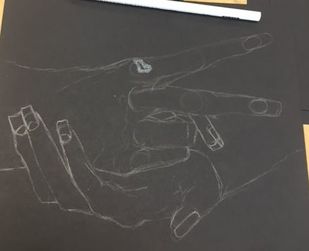
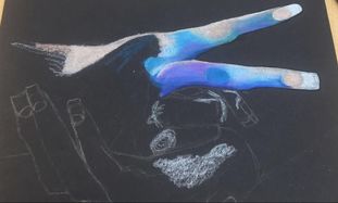
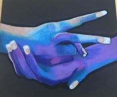 For our figure assignment, I decided to depict hands “scissors,” from the classic game rock, paper, scissors. I used multiple layers of prismacolor to complete this work. Prisma color is one of my favorite mediums so I wanted to implicate that for this project. I used arbitrary color to contradict the harsh message scissors can sometimes represent. My goal with this work was to allow different interpretations, and to really represent calmness where there is usually violence. As far as the outcome, I am very pleased on how my piece looks completed.
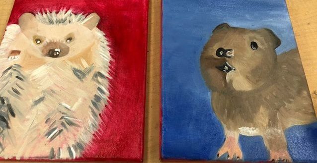
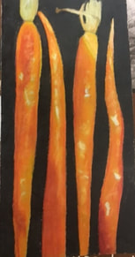 This is my picture I was able to complete for the texture part of prism boot camp. I learned how to blend colors more seamlessly. One thing I learned that I love to do now is strong white highlights. I learned about myself that I love the look of the strong white highlights because I love the detention it gives my artwork and it has helped develop my style. One of the challenges I had was getting the colors just right. I also had a hard time with the stem of the carrot, getting the color right and achieving the texture I desired. I have a hard time with fine detail and getting the detail there was hard for me.  This was one of my ten minute challenge drawings. This one was one of the most rememberable ones for me because it was my favorite. As I mentioned previously, I LOVE the stark white highlights, I also love using blank space to really emphasize my drawing (only doing an outline), and I love using unique and new colors on ordinary things. So for me, this was my ideal piece. I also love drawing anything organic or from the outdoors, so being able to do this made it that much more enjoyable. 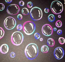 During this project, I struggled greatly with the ideas and execution. I originally was going to do something completely different, but unfortunately that did not pan out. Instead, I developed a class activity to my final project. I've always liked bubbles, they are fun, whimsical, and remind me of my childhood. My goal was to make something fun and happy. I really used unique colors and blended the colors together, that skill was greatly improved thru the bootcamp, and again used my stark white highlights on the bubbles. I used black paper to really make them stand out, and I really wanted to make them look like they were flouting and were random and effortless. The hardest part for me was just choosing the size, placement, and juxtaposition of the bubbles throughout the paper. One thing I wish I could change was some of the smaller bubbles I don't like the highlights, I wish I made them more defined and maybe added some highlights in the background as well.
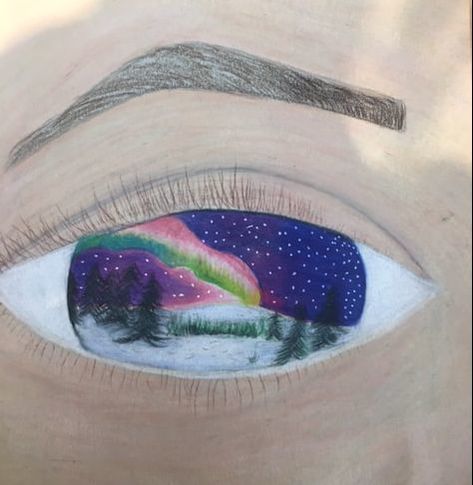
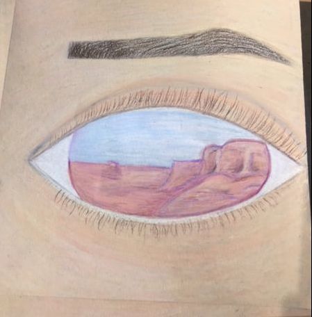
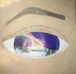
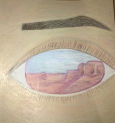
For this assignment, we were assigned to choose a word that is often trite and make it non-trite. The word I chose was "Beauty,". I chose this word because beauty is different to every single person and I wanted to demonstrate that. So I decided to do beauty in the eye of the beholder quite literally. I chose to demonstrate two different views of beauty. One hot climate, one cold, one colorful, one peaceful. The medium I used was prismacolor. Photos on left no flash, right is with flash.
|
AuthorWrite something about yourself. No need to be fancy, just an overview. Archives
January 2018
Categories |
 RSS Feed
